Web Design Mastery: Join Top-rated Web Design Classes in Pune!
Web Design Overview
What is web design?
A website's layout and visual appeal are all part of its usability and functionality. It is putting together a coherent and interesting user experience.
The Web Design Principles
- Balance: Achieving visual balance in a design is done by equally dispersing elements.
- Proximity: Proximity is arranging similar components in a hierarchical and orderly manner.
- Contrast: Contrast is the technique of highlighting objects by variations in size, colour, and form.
- Alignment: Making sure that parts line up to provide a visually appealing layout.
- Repetition: Repetition is using specific design components again to establish uniformity and strengthen branding.
Understanding User Experience
- Relevance of UX in Web Design: User experience studies how people interact with websites and aims to make that interaction as smooth and easy as feasible.
- User-centred design approach: It is creating websites with the needs and preferences of the user in mind; to maximise the user experience, user research, prototyping, and testing are frequently used.
Web development vs web design
- Setting Apart the Functions of Design and Development
- Collaboration between Designers and Developers
Learning Principles and Components of Web Design in Web Design Courses in Pune
Psychological Theory of Colour
- Understanding Colour Schemes: Complementary, similar, monochromatic, and other colour schemes are examined, along with their psychological impacts on users.
- Color's Effect on User Perception: How colours may improve user experience, communicate meaning, and affect feelings.
Typography
- Choosing Fonts: Choosing suitable fonts that improve readability and complement the branding of the website.
- Font Pairing Techniques: Font pairing techniques are the use of complementary styles and weights to produce hierarchy and visual interest in font pairings.
Layout Design
- Grid Systems: Web design structure and consistency are created by using grid-based layouts.
- Principles of Responsive Design: Using responsive design strategies, create websites that adjust to various screen sizes and devices.
Visual Hierarchy
- The need of hierarchy in web design: It facilitates user navigation of the website and comprehension of the content hierarchy.
- Methods of Establishing Visual Hierarchy: Setting content priorities and directing user attention with size, colour, contrast, and space.
In web design, tools and technologies
Graphics Design Softwares
- Adobe Photoshop: For mockups and raster graphic creation and modification.
- Adobe Illustrator: Vector graphic and illustration creation programme.
- Sketch: User interfaces and vector graphics are created with the widely used design programme Sketch.
Prototyping Instruments
- Wireframing, prototyping, and user experience design with Adobe XD.
- Figma is an interface and prototype development collaborative design tool.
- For building interactive prototypes and getting stakeholder input, use InVision.
Version Control Systems
- Git is a distributed version control system for code changes tracking and developer collaboration.
- Git-powered web-based version control hosting service is called GitHub.
Web Design Resources
- Stock Images and Icons: For usage in web design projects, websites like Unsplash and Flaticon offer excellent stock images.
- Colour Palette Generators: User preferences are used to create colour palettes using programmes like Colours and Adobe Colour.
- Font Libraries: A large collection of fonts are available for web design projects at websites like Adobe Fonts and Google Fonts.
Designing User Interfaces in Web Design Training Institute in Pune
General Principles of UI Design
- Consistency: Keeping the layout, interactions, and design components of the website consistent.
- Simplicity: Avoiding cluttered and superfluous components, the interface should be straightforward and understandable.
- Feedback: Giving consumers comments when they engage with elements—like button clicks or form submissions—is known as feedback.
- Accessibility: Accessibility is the design of WCAG-compliant interfaces for users with impairments.
Navigation Design
- Navigation menu design is the process of creating user-friendly menus that direct visitors around a website.
- Displaying users' present position inside the website structure using breadcrumbs.
- Including search capabilities will let consumers locate the information they need fast.
Form Design
- Form layout best practices are to design forms with logical grouping, legible labelling, and appropriate alignment.
- Form input validation offers real time feedback to assist users in fixing mistakes before submission.
Button Design
- Call-to-action buttons: Creating eye-catching, conspicuous call-to-action buttons is one way to promote user engagement.
- Techniques for Button Styling: Sorting primary and secondary buttons and indicating their significance using colour, size, and form.
Responsive Design
Context of Responsive Design
- Definition and Relevance: Websites with responsive design look and work well on desktops, laptops, tablets, and cellphones.
- Approaching Mobile First: Making websites initially for mobile devices and then adjusting for bigger screens.
Media Queries
- Application of various styles depending on the screen size, resolution, and orientation of the device using CSS Media Queries.
- Identifying the points at which the website's design modifies to suit various screen sizes is known as a breakpoint.
Flexible Designs
- Fluid Grids: Fluid grids are layouts created by employing percentages rather than set units to provide flexible and fluid designs.
- Flexible pictures & Media: Make sure pictures and media scale proportionately on various devices by using relative units like max-width and percentages.
Responsive Navigation
- Using the hamburger symbol, place collapsible navigation menus on smaller displays.
- To conserve space on smaller displays, off-canvas navigation moves navigation off-screen and reveals it when user input triggers it.
Best Practices of Web Design and Optimisation in Online Web Design Training Institute in Pune
Website Performance Optimisation
- Minification of HTML, JavaScript, and CSS
- Image Optimisation Methods
- catching
Search Engine Optimisation
- Search engine optimisation of content structure, headers, and meta tags (title, description, keywords) is known as on-page SEO.
- Writing pertinent and evocative meta tags and descriptions will increase click-through rates and search engine exposure.
Website Accessibility
- Web Content Accessibility Guidelines (WCAG): Knowing and using these standards will guarantee that websites are usable by people with impairments.
- Tools and Testing for Accessibility: Conducting Manual accessibility audits and identifying and resolving accessibility problems using accessibility testing tools like WAVE and Axe.
Testing Usability
- Conducting User Testing: Recruitment of people to test the website and offer comments on navigation, usability, and general user experience.
- Analysing User Feedback: User input is used to iteratively enhance the design by collecting and analysing user feedback to pinpoint areas for improvement and pain points.
Conclusion
If anyone wants to achieve mastery in web design then he should join Lotus IT Hub, the best web design training institute in pune, Maharashtra as soon as possible. Lotus IT Hub offers web design classes in Pune at affordable fees and its courses are designed for both novices and experts.
FAQ - Frequently Asked Questions
💬 Talk to Adviser
Get expert guidance from our experienced professionals in every field.
Skills & Tools You'll Learn
Programming Fundamentals
- Algorithms & Data Structures
- Problem Solving
- OOP Concepts
- Version Control (Git)
Development Tools
- IDEs & Text Editors
- CLI & Terminal
- Package Managers
- Build Tools
Software Practices
- Agile & Scrum
- Testing (Unit & Integration)
- Code Reviews
- CI/CD Workflows
Platforms & Technologies
- Databases (SQL/NoSQL)
- Cloud (AWS, GCP)
- APIs (REST & GraphQL)
- Docker & Kubernetes
Our Certifications
Gain globally recognized certifications that validate your skills and boost your career.
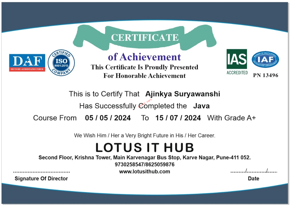
Earn Your Achievement Certificate

After completing your course, you’ll receive a verified certificate from Lotus IT Hub, showcasing your mastery of industry-relevant skills. This certificate can be shared on LinkedIn, added to your resume, and helps you stand out in the job market.
- Globally recognized certificate
- Verification ID for authenticity
- Downloadable digital format
- Shareable on LinkedIn & portfolios
Why Choose Lotus IT Hub
Empowering your career through expert training
Affordable & Customized Programs
Flexible pricing and learning plans
Hands-On Project Learning
Real-world practice to boost your skills
One-on-One Mentorship
Personalized guidance from industry experts


